+44 (0) 1223 378 000
info@cpl.co.uk
1 Cambridge
Technopark,
Newmarket Road,
Cambridge,
CB5 8PB, UK
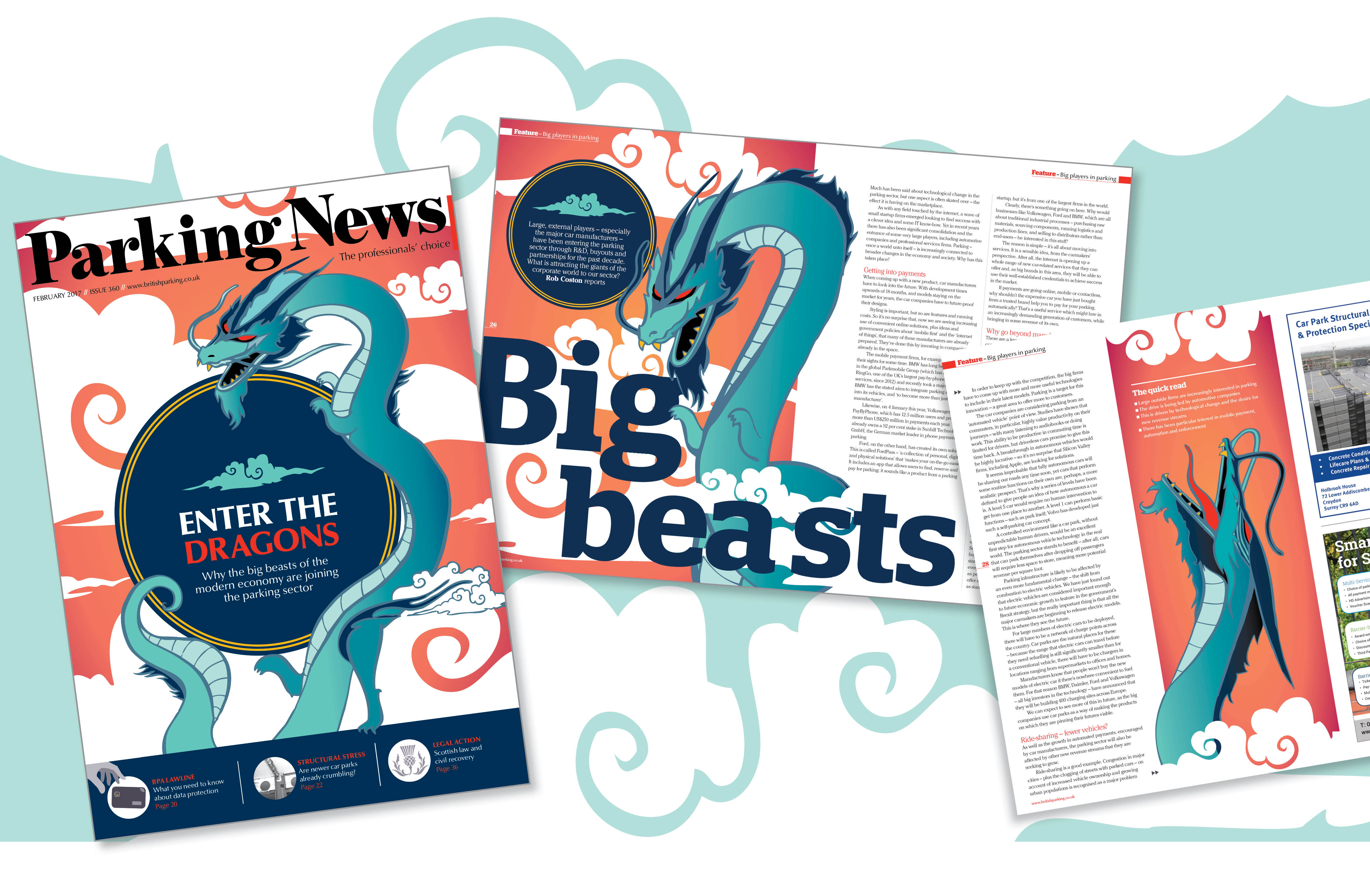
As a designer at CPL, much of my job involves creating attractive layouts for editorial pages. But sometimes – when an editor wants something a bit special – I get to indulge my creative impulse by coming up with a bespoke illustration.
What you might not be aware of is the planning that goes into such a project. I recently illustrated a piece for Parking News – the magazine of the British Parking Association – which showcases the hard work and careful thought involved.
The challenge
Parking is a practical profession so – understandably – features in Parking News are frequently illustrated with images of car parks. As a result, it’s important to shake things up every so often, and get away from concrete (literally), practical images.
The article in question was the lead feature – plus an accompanying cover – on the subject of big, new players moving into the parking sector through research and development, buyouts and partnerships. I suggested to the editor that it might be a good opportunity to do something a bit different.
Brainstorming the illustration
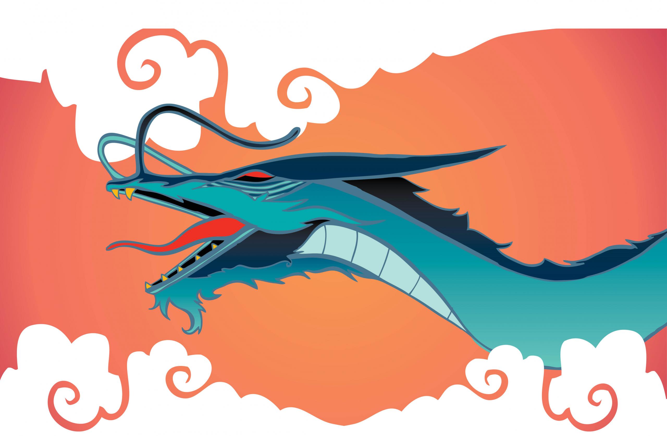
I came up with the idea of representing the large firms entering the market as dragons because of the power of the image and its multiple associations – they are lucky animals in Chinese mythology, threatening beasts in the Western tradition, and are metaphorically linked with big business by the television show Dragon’s Den.
The depiction of the dragon needed to be complex; the large players entering the parking sector are threatening in some ways, but can also be seen as a dynamic force that represents positive change. This was reflected in the final illustration.
Developing the idea
Initially, I developed the dragon concept on paper, by making a number of sketches. From these, the editor and I decided we preferred an oriental-style dragon – a flying, snake-like creature enveloping an orb, representing ‘the world of parking’. The body of this style of dragon lends itself to dynamic, twisting poses. Traditionally, oriental dragons have feet that resemble those of chickens, but I decided to update the dragon by giving it plump arms and legs to create a little charm and character.
Once the style and tone of the illustration had been agreed, I began free-hand drawing – creating different angles and positions in which to view the dragon, as well as close-ups and detail for the face. Next, I scanned an ink version and converted it into a vector graphic in Adobe Illustrator to allow ease of scaling within InDesign. Many lines had to be cleaned up and redrawn but, to keep the sense of an organic design, I left some of the lines imperfect.
Colour considerations
Bold colours and a consideration of colour psychology helps artwork stand out – it’s important to get that ‘wow factor’, given that this magazine is frequently displayed in the reception areas of large companies.
I chose blues and teals for the dragon, to represent an icy temperament. Blue is seen as reliable, responsible and mentally strong. The contrasting orange-reds were used to warm the piece and offset the blues; red is a very powerful, energising colour. Though continually analysed, the psychological impact of red is still moderately subjective, which is why I used an orange gradient. Orange is known to be the colour of motivation; the positioning of the greatest concentration of orange behind the dragon’s head within the artwork is no accident.
The visual tension between the oranges, reds and blues reflects the tension in the article between the threat posed by new players and the positive change that they can represent.
Fitting form to function
Finally, it was time to consider the design in light of the feature space. I drew up the pages and spreads like a storyboard, drafted how the dragons would ‘enter’ each page in a dynamic and fluid way, and how this would aid the flow of the copy.
I considered balance within the piece – how the white space would contrast with the bold colours and allow breathing space. The initial spread is intentionally ‘left-heavy’ to lead the reader into the piece. The white space on the right-hand page is a space for ‘refreshment’, so that the next bold dragon page is just as impactful.
The result
Creating an illustration is a lot of work, but it’s also a lot of fun.
The final result is a striking cover and lead feature, one that attracts the eye, supports the content and invites interest from parking professionals more used to ‘conventional’ illustrations.
Share: